
Migrating Landscape
Canonical

Product design
Bringing Canonical’s Landscape into the modern age
Landscape is a product by Canonical, part of the Ubuntu ecosystem. It is a tool designed to help systems administrators manage the state of Ubuntu machines at scale, regardless of how Ubuntu is consumed. Landscape provides the flexibility to manage machines and containers individually (often referred to as pets) or in large fleets (cattle).
Originally released in 2008, Landscape was actively maintained and developed until around 2015. During this period, it saw widespread adoption for its ability to simplify the management of Ubuntu estates. However, while it continued to be widely used beyond 2015, its codebase was not significantly modernised, and its user interface gradually fell out of date with evolving interaction patterns and design expectations.
In 2023, Canonical initiated a project to modernise Landscape, with practical development momentum picking up in early 2024. This effort aims to unlock the full potential of Landscape as a modern portal into the broader Canonical ecosystem. In particular, it reinforces its connection to Ubuntu Pro — Canonical’s subscription service that offers enhanced security, extended support, and comprehensive management tools for Ubuntu environments, ensuring estates remain secure and well-maintained beyond the standard Ubuntu lifecycle.

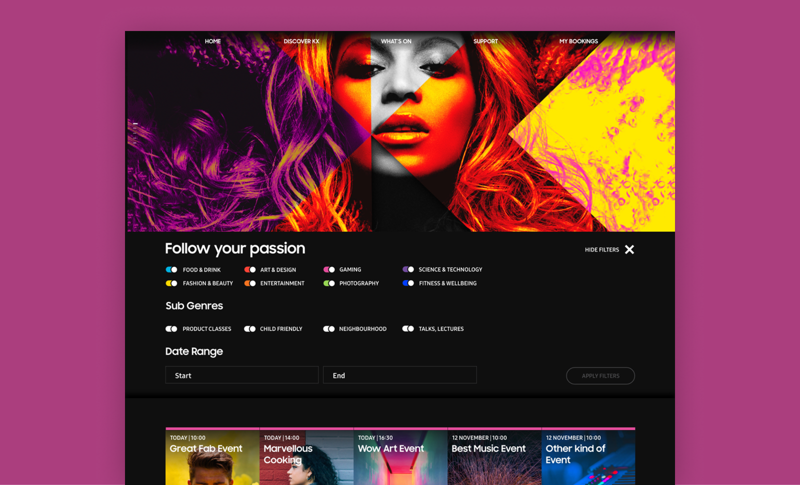
On the left, the legacy dashboard. On the right, the current implementation of the new designs.
Interaction patterns
Our task was to modernise Landscape, Canonical’s management and monitoring tool for Ubuntu instances, within a 6-month timeframe. The application had been designed in an earlier era of web development, and many of its user interface patterns had become outdated, error-prone, and inaccessible by modern standards.
Broadly, there was inconsistency across the application in how users interacted with different elements, creating a fragmented and confusing experience. Even through a heuristic evaluation alone, it was clear the interface had become obsolete and no longer fit for purpose. For example, the interface often relied on icons as the only way to convey meaning, provided little or no feedback during interactions such as hovering or clicking, and lacked visibility into system status.
Example of the issues with the legacy dashboard.
Landscape’s main use cases revolve around managing and monitoring instances — a general term for all types of computers, including virtual machines and containers like LXD or Kubernetes. Much of the day-to-day focus is on managing the software packages installed in these instances, ensuring they stay up to date and secure against known vulnerabilities.
A clear example of the outdated interaction design could be seen in how users navigated their list of instances. Users could select multiple computers from a list, which would then activate a set of action tabs located at the top-right corner of the web app. Interacting with these tabs would prompt Landscape to attempt to aggregate data from across the selected machines — even when that data wasn't meaningful at a group level, like individual hardware configurations. The interface would then paginate users through individual machine details, offering little contextual guidance.
This pattern illustrates the kind of challenges we faced throughout the redesign. In modern interfaces, selecting table elements should not control unrelated UI areas outside the table itself. Additionally, information that cannot be meaningfully aggregated should be excluded from bulk views, to prevent clutter and confusion. As part of our process, we systematically reviewed and redesigned hundreds of these outdated interactions, replacing them with standardised, modern patterns and ensuring consistent behaviours across the application.
This painstaking review and redesign work was one of the key reasons this migration was so challenging — especially under an ambitious 6-month timeframe. It wasn’t just a visual refresh, but a complete rethinking of interaction models to align with current standards of usability and accessibility.
Systematising the behaviour of entities in Landscape
To create a sense of predictability across user interactions in the application, we systematised the behaviour of every interactive element. Landscape was re-built on top of our App layout, Canonical’s standard web application grid, designed to maximise space efficiency while offering users a familiar experience aligned with modern web application conventions.
The App layout typically consists of a side navigation and a main content area. First-level pages accessed through the side navigation usually present either a dashboard or a table view. These tables follow established interaction patterns: multi-selection, pagination, search, filtering, and an action bar for bulk operations. When users select checkboxes within a table, relevant actions become available. When they click on the name of an entity, they’re taken to a page displaying static details about that specific item.
However, Landscape’s original interface often diverged from these patterns, which led to inconsistent and confusing experiences. Selecting items in a table would activate actions placed outside of the table context, disrupting the user’s flow. Additionally, data that couldn’t be meaningfully aggregated still appeared in bulk views, creating unnecessary noise.
In the following section, I’ll describe how we addressed these inconsistencies. I’ll explain the specific principles and decisions we applied to harmonise layouts and behaviours across the product — from tables and detail views, to action flows and feedback mechanisms — ultimately shaping a more coherent and user-friendly experience.
Table pages
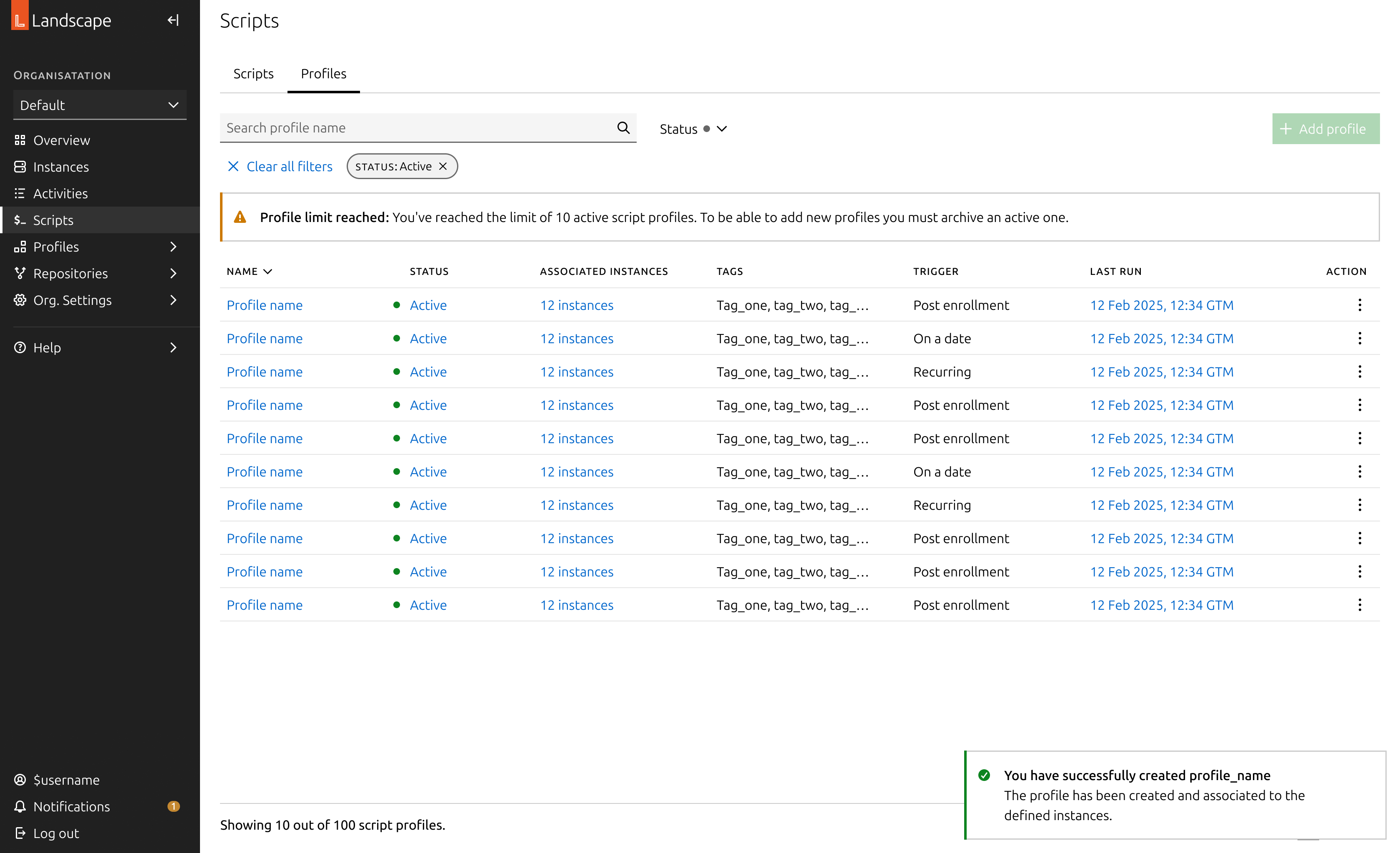
Table pages are structured around a table as the primary element of the page. This table lists the entities relevant to the page’s purpose, displaying the most critical information at a glance. To enhance usability and efficiency, these tables commonly include:
- Search functionality: A free text input that allows users to search for entities. On more advanced pages, this includes support for complex query syntax, enabling users to filter machines or entities based on multiple criteria and conditions.
- Filters: A set of dropdown menus highlighting the most important attributes of each entity, helping users quickly narrow down large sets of data to find exactly what they need.
- Bulk actions: Actions that become available when users select one or more checkboxes in the table rows. These actions allow users to efficiently apply changes or updates to multiple entities at once.
- Links to detail pages: Each entity name acts as a link to its dedicated detail page, providing in-depth information and controls specific to that entity.
- Selection checkboxes: Located on each row, these enable users to select multiple items for bulk actions.
- Pagination: Essential for navigating extensive estates, pagination helps break down large sets of data into manageable chunks.
Detail pages
The details of each entity are typically displayed in side panels, which can vary in size. For more complex detail pages, these are shown on a full page, with a breadcrumb navigation to ensure users can easily trace their steps. The information is often presented as key-value pairs, though the specific layout and structure are left to the discretion of the designer.
To offer flexibility, the side panel comes in three sizes, allowing users to view the entity details while still keeping the original list in view. This ensures that users can quickly access key information without losing context of their previous actions.
Actions
When a user performs an action, a form typically opens to capture the necessary variables for that action. In Landscape, these forms are displayed in side panels, allowing users to maintain visibility of their selection. For more complex forms, we may design them as full pages with a back button, although we haven't encountered this situation yet.
The buttons on an action panel adapt to the contents of the form and will become sticky at the bottom if the form overflows the viewport. Additionally, the action buttons are disabled until all required fields are completed.
Dashboard and reports
Some pages provide an overview of the entire estate or generate data visualisations in the form of actionable reports. These pages were designed using a bento box layout, with containers that group related information and their corresponding graphs.
Migration in practice: Instances
To illustrate the migration of a complete feature, I will walk through the migration of the most important section: the instances page.
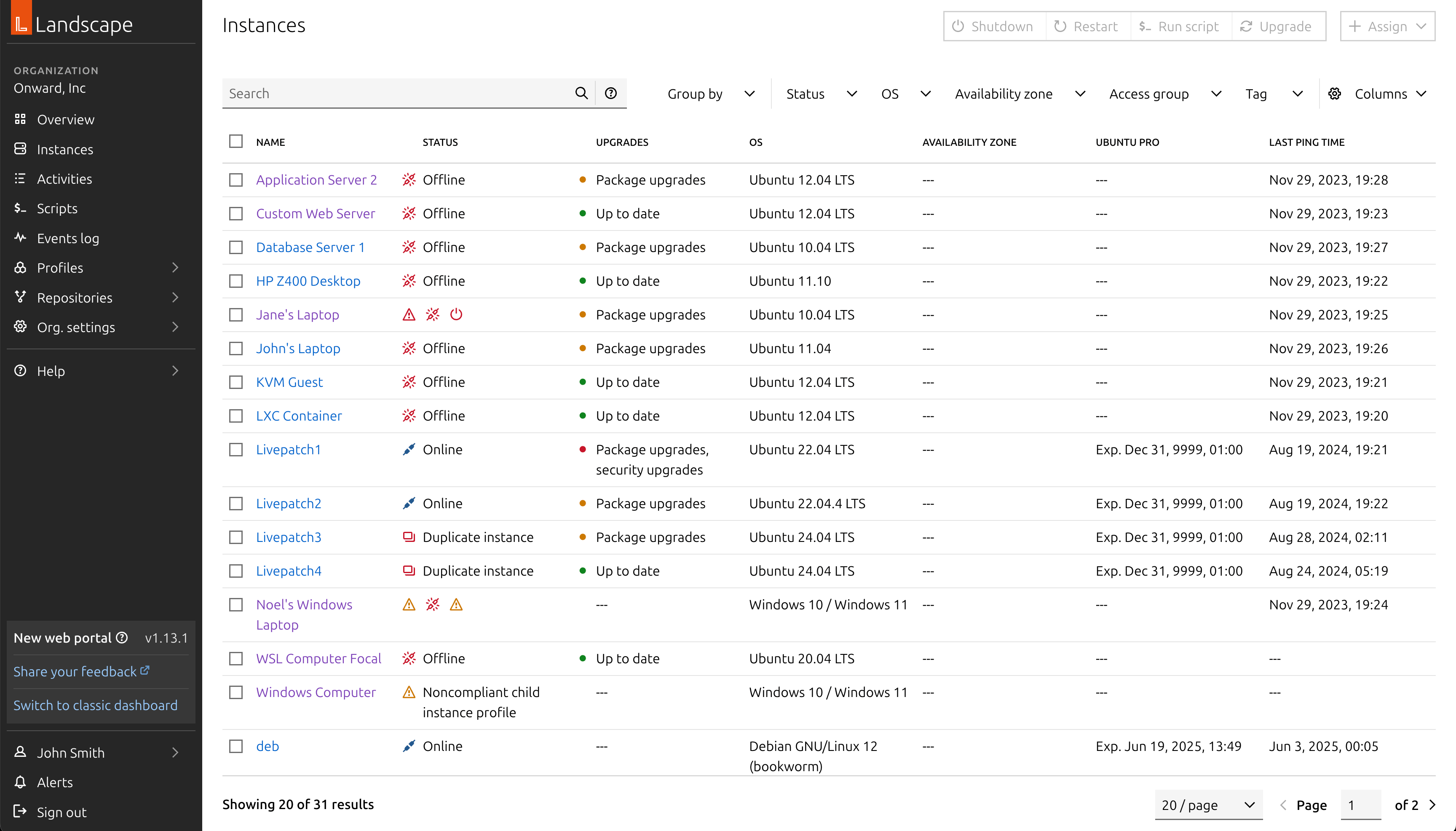
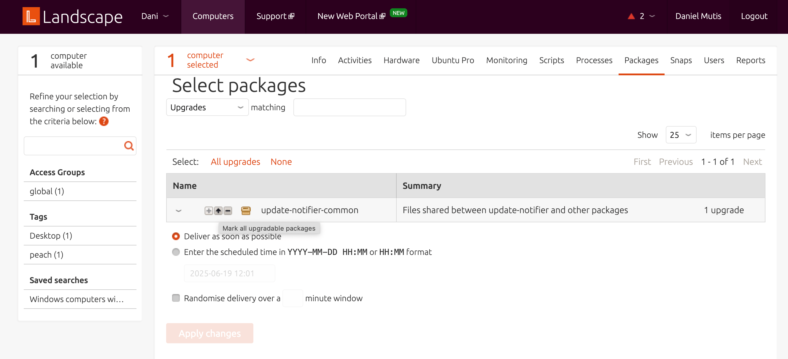
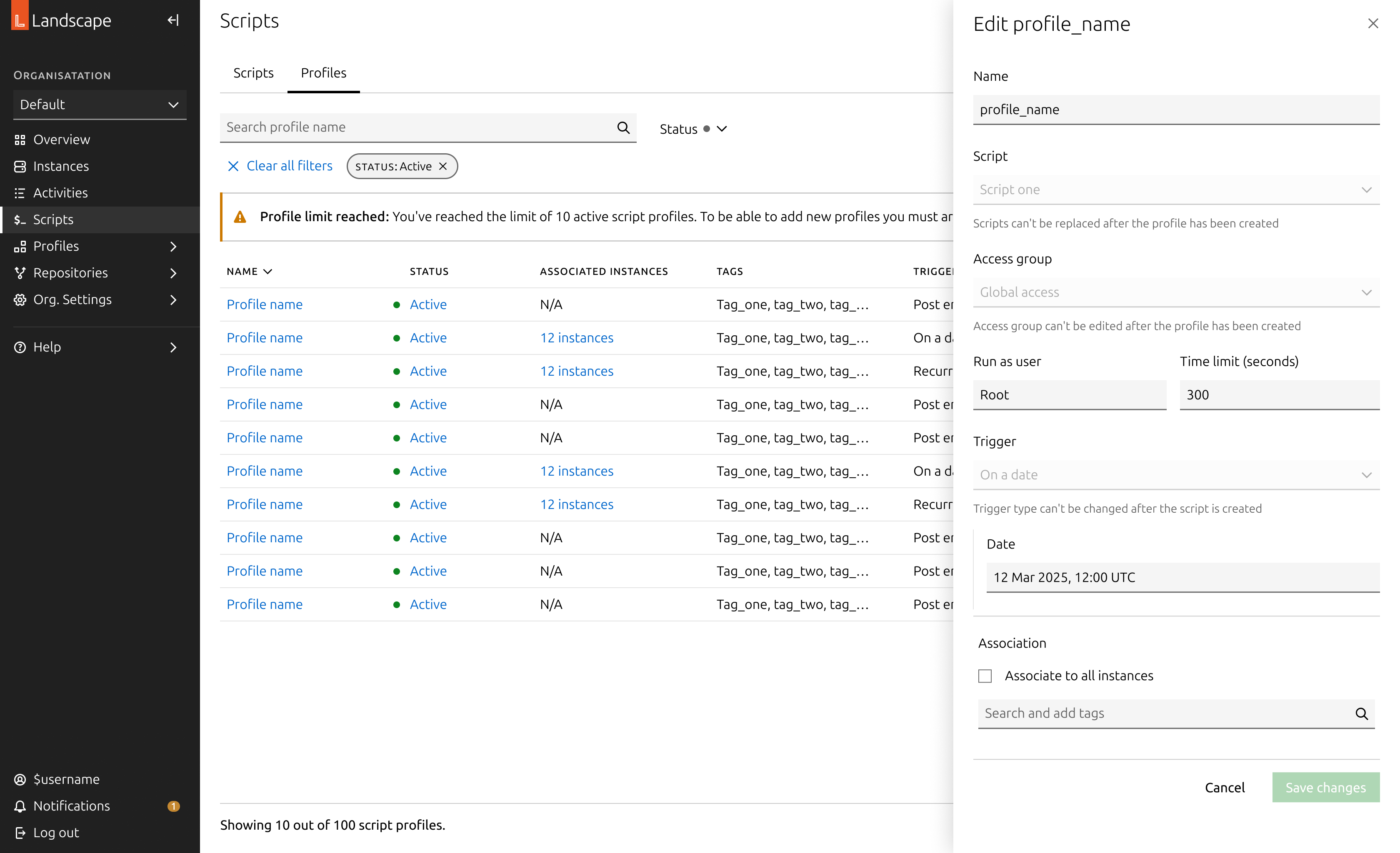
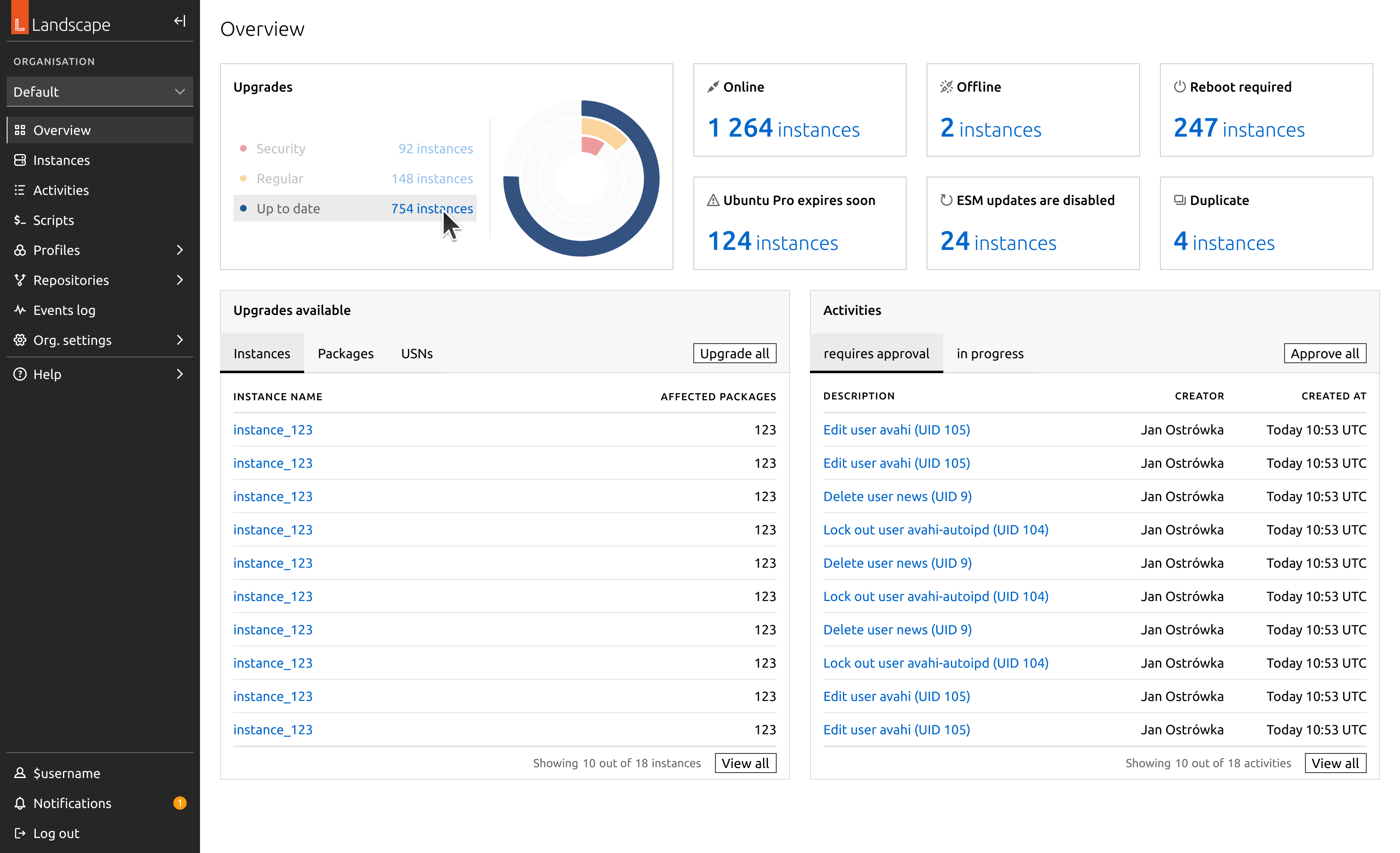
In migrating this section, we removed access to the aggregated views as they were previously designed. Any aggregated view that makes sense at scale has now been converted into a bulk action. For example, when a user selects a set of machines and clicks “Upgrade,” this action opens a large side panel displaying a summarised view of all available upgrades for their selection.
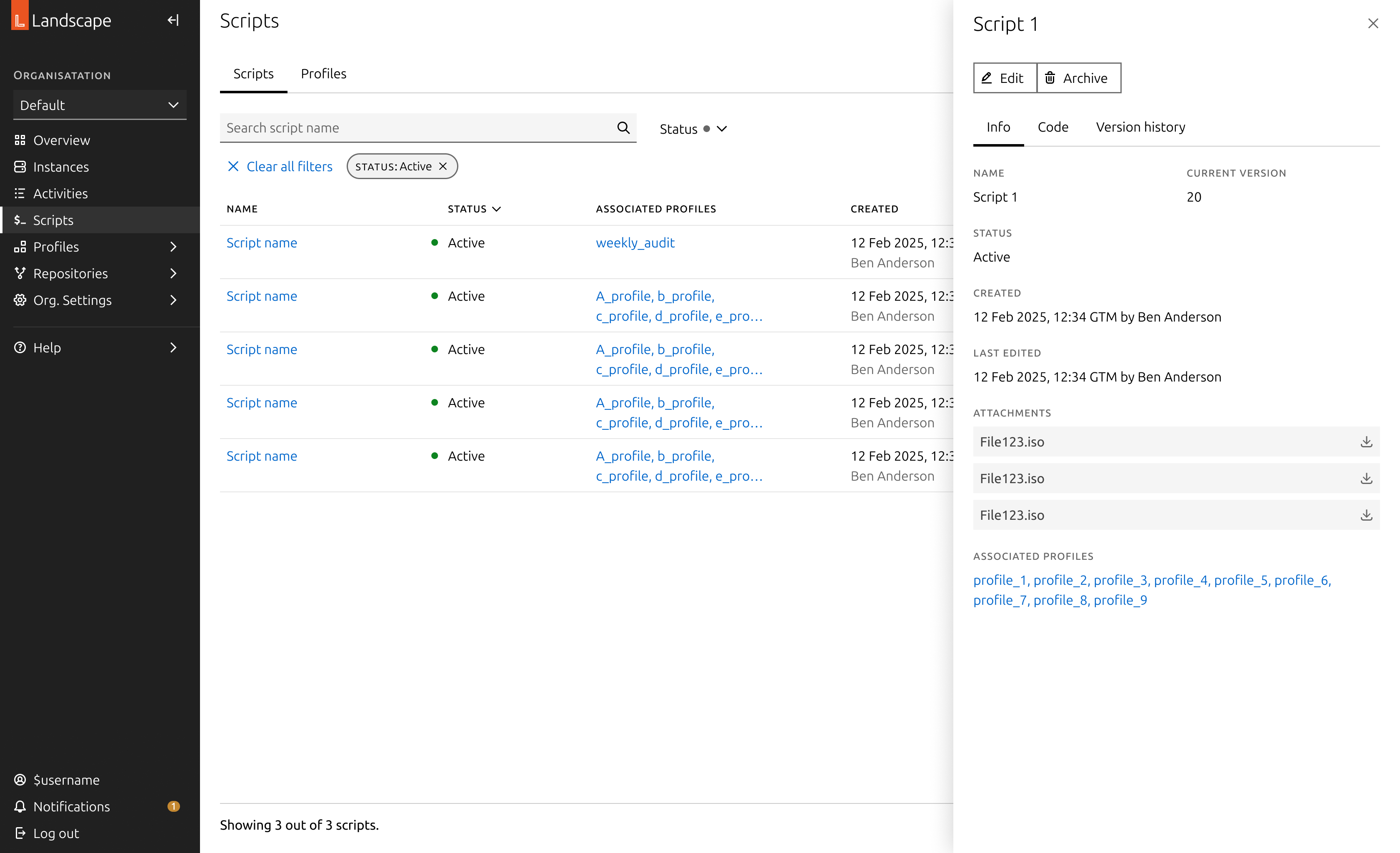
We moved the detailed views of each instance into dedicated detail pages. These are more complex, featuring multiple tabs that represent different aspects of each machine. As such, they have been designed as full pages with a breadcrumb for easy navigation. The first tab provides a summary of the machine’s status and key characteristics, while all other tabs list relevant machine information, such as kernel health or security vulnerabilities.
To further explore the migration, here is a gallery showcasing various pages that have been migrated.
Evaluation
To conclude this project, we conducted an extensive evaluation of our approach with both internal users and external customers. We identified a few issues related to package management at scale, which have been planned as future work. However, overall, we found that the UI improvements significantly enhanced usability from a qualitative perspective.
We implemented a banner in the side navigation of the app, allowing users to submit feedback on the new dashboard. So far, none of the reported issues have been related to design. Most reports pertain to performance issues with the codebase or minor data inconsistencies. We will continue monitoring these to evaluate the user experience.
Another major concern is the experience of users in air-gapped environments, whose machines do not have internet access. These users require additional attention to ensure a smoother experience, as their package management is often handled differently, through mirroring repositories.
Further work
This migration is a milestone in modernising one of the key products in Canonical’s portfolio. This migration was crucial in order to build on top of a solid base of features to provide a more tailored and advanced experience to our user base, and to address security vulnerabilities with the old interface.
Several of the initiatives we carried out in this project were cut in the implementation phase due to lack of engineering resources. This has led us to negotiate more in-depth the experiences we create in collaboration with our back-end counterparts. In this regard, we have strengthened our approach to acceptance criteria of products and intensified our communication to evaluate designs in a more accurate way.

Migrating Landscape
Canonical
Product design
Bringing Canonical’s Landscape into the modern age
Landscape is a product by Canonical, part of the Ubuntu ecosystem. It is a tool designed to help systems administrators manage the state of Ubuntu machines at scale, regardless of how Ubuntu is consumed. Landscape provides the flexibility to manage machines and containers individually (often referred to as pets) or in large fleets (cattle).
Originally released in 2008, Landscape was actively maintained and developed until around 2015. During this period, it saw widespread adoption for its ability to simplify the management of Ubuntu estates. However, while it continued to be widely used beyond 2015, its codebase was not significantly modernised, and its user interface gradually fell out of date with evolving interaction patterns and design expectations.
In 2023, Canonical initiated a project to modernise Landscape, with practical development momentum picking up in early 2024. This effort aims to unlock the full potential of Landscape as a modern portal into the broader Canonical ecosystem. In particular, it reinforces its connection to Ubuntu Pro — Canonical’s subscription service that offers enhanced security, extended support, and comprehensive management tools for Ubuntu environments, ensuring estates remain secure and well-maintained beyond the standard Ubuntu lifecycle.
On the left, the legacy dashboard. On the right, the current implementation of the new designs.
Interaction patterns
Our task was to modernise Landscape, Canonical’s management and monitoring tool for Ubuntu instances, within a 6-month timeframe. The application had been designed in an earlier era of web development, and many of its user interface patterns had become outdated, error-prone, and inaccessible by modern standards.
Broadly, there was inconsistency across the application in how users interacted with different elements, creating a fragmented and confusing experience. Even through a heuristic evaluation alone, it was clear the interface had become obsolete and no longer fit for purpose. For example, the interface often relied on icons as the only way to convey meaning, provided little or no feedback during interactions such as hovering or clicking, and lacked visibility into system status.
Example of the issues with the legacy dashboard.
Landscape’s main use cases revolve around managing and monitoring instances — a general term for all types of computers, including virtual machines and containers like LXD or Kubernetes. Much of the day-to-day focus is on managing the software packages installed in these instances, ensuring they stay up to date and secure against known vulnerabilities.
A clear example of the outdated interaction design could be seen in how users navigated their list of instances. Users could select multiple computers from a list, which would then activate a set of action tabs located at the top-right corner of the web app. Interacting with these tabs would prompt Landscape to attempt to aggregate data from across the selected machines — even when that data wasn't meaningful at a group level, like individual hardware configurations. The interface would then paginate users through individual machine details, offering little contextual guidance.
This pattern illustrates the kind of challenges we faced throughout the redesign. In modern interfaces, selecting table elements should not control unrelated UI areas outside the table itself. Additionally, information that cannot be meaningfully aggregated should be excluded from bulk views, to prevent clutter and confusion. As part of our process, we systematically reviewed and redesigned hundreds of these outdated interactions, replacing them with standardised, modern patterns and ensuring consistent behaviours across the application.
This painstaking review and redesign work was one of the key reasons this migration was so challenging — especially under an ambitious 6-month timeframe. It wasn’t just a visual refresh, but a complete rethinking of interaction models to align with current standards of usability and accessibility.
Systematising the behaviour of entities in Landscape
To create a sense of predictability across user interactions in the application, we systematised the behaviour of every interactive element. Landscape was re-built on top of our App layout, Canonical’s standard web application grid, designed to maximise space efficiency while offering users a familiar experience aligned with modern web application conventions.
The App layout typically consists of a side navigation and a main content area. First-level pages accessed through the side navigation usually present either a dashboard or a table view. These tables follow established interaction patterns: multi-selection, pagination, search, filtering, and an action bar for bulk operations. When users select checkboxes within a table, relevant actions become available. When they click on the name of an entity, they’re taken to a page displaying static details about that specific item.
However, Landscape’s original interface often diverged from these patterns, which led to inconsistent and confusing experiences. Selecting items in a table would activate actions placed outside of the table context, disrupting the user’s flow. Additionally, data that couldn’t be meaningfully aggregated still appeared in bulk views, creating unnecessary noise.
In the following section, I’ll describe how we addressed these inconsistencies. I’ll explain the specific principles and decisions we applied to harmonise layouts and behaviours across the product — from tables and detail views, to action flows and feedback mechanisms — ultimately shaping a more coherent and user-friendly experience.
Table pages
Table pages are structured around a table as the primary element of the page. This table lists the entities relevant to the page’s purpose, displaying the most critical information at a glance. To enhance usability and efficiency, these tables commonly include:
- Search functionality: A free text input that allows users to search for entities. On more advanced pages, this includes support for complex query syntax, enabling users to filter machines or entities based on multiple criteria and conditions.
- Filters: A set of dropdown menus highlighting the most important attributes of each entity, helping users quickly narrow down large sets of data to find exactly what they need.
- Bulk actions: Actions that become available when users select one or more checkboxes in the table rows. These actions allow users to efficiently apply changes or updates to multiple entities at once.
- Links to detail pages: Each entity name acts as a link to its dedicated detail page, providing in-depth information and controls specific to that entity.
- Selection checkboxes: Located on each row, these enable users to select multiple items for bulk actions.
- Pagination: Essential for navigating extensive estates, pagination helps break down large sets of data into manageable chunks.
Detail pages
The details of each entity are typically displayed in side panels, which can vary in size. For more complex detail pages, these are shown on a full page, with a breadcrumb navigation to ensure users can easily trace their steps. The information is often presented as key-value pairs, though the specific layout and structure are left to the discretion of the designer.
To offer flexibility, the side panel comes in three sizes, allowing users to view the entity details while still keeping the original list in view. This ensures that users can quickly access key information without losing context of their previous actions.
Actions
When a user performs an action, a form typically opens to capture the necessary variables for that action. In Landscape, these forms are displayed in side panels, allowing users to maintain visibility of their selection. For more complex forms, we may design them as full pages with a back button, although we haven't encountered this situation yet.
The buttons on an action panel adapt to the contents of the form and will become sticky at the bottom if the form overflows the viewport. Additionally, the action buttons are disabled until all required fields are completed.
Dashboard and reports
Some pages provide an overview of the entire estate or generate data visualisations in the form of actionable reports. These pages were designed using a bento box layout, with containers that group related information and their corresponding graphs.
Migration in practice: Instances
To illustrate the migration of a complete feature, I will walk through the migration of the most important section: the instances page.
In migrating this section, we removed access to the aggregated views as they were previously designed. Any aggregated view that makes sense at scale has now been converted into a bulk action. For example, when a user selects a set of machines and clicks “Upgrade,” this action opens a large side panel displaying a summarised view of all available upgrades for their selection.
We moved the detailed views of each instance into dedicated detail pages. These are more complex, featuring multiple tabs that represent different aspects of each machine. As such, they have been designed as full pages with a breadcrumb for easy navigation. The first tab provides a summary of the machine’s status and key characteristics, while all other tabs list relevant machine information, such as kernel health or security vulnerabilities.
To further explore the migration, here is a gallery showcasing various pages that have been migrated.
Evaluation
To conclude this project, we conducted an extensive evaluation of our approach with both internal users and external customers. We identified a few issues related to package management at scale, which have been planned as future work. However, overall, we found that the UI improvements significantly enhanced usability from a qualitative perspective.
We implemented a banner in the side navigation of the app, allowing users to submit feedback on the new dashboard. So far, none of the reported issues have been related to design. Most reports pertain to performance issues with the codebase or minor data inconsistencies. We will continue monitoring these to evaluate the user experience.
Another major concern is the experience of users in air-gapped environments, whose machines do not have internet access. These users require additional attention to ensure a smoother experience, as their package management is often handled differently, through mirroring repositories.
Further work
This migration is a milestone in modernising one of the key products in Canonical’s portfolio. This migration was crucial in order to build on top of a solid base of features to provide a more tailored and advanced experience to our user base, and to address security vulnerabilities with the old interface.
Several of the initiatives we carried out in this project were cut in the implementation phase due to lack of engineering resources. This has led us to negotiate more in-depth the experiences we create in collaboration with our back-end counterparts. In this regard, we have strengthened our approach to acceptance criteria of products and intensified our communication to evaluate designs in a more accurate way.