
Snapcraft.io releasing flow redesign
Canonical

Product design
Bringing Canonical’s Landscape into the modern age
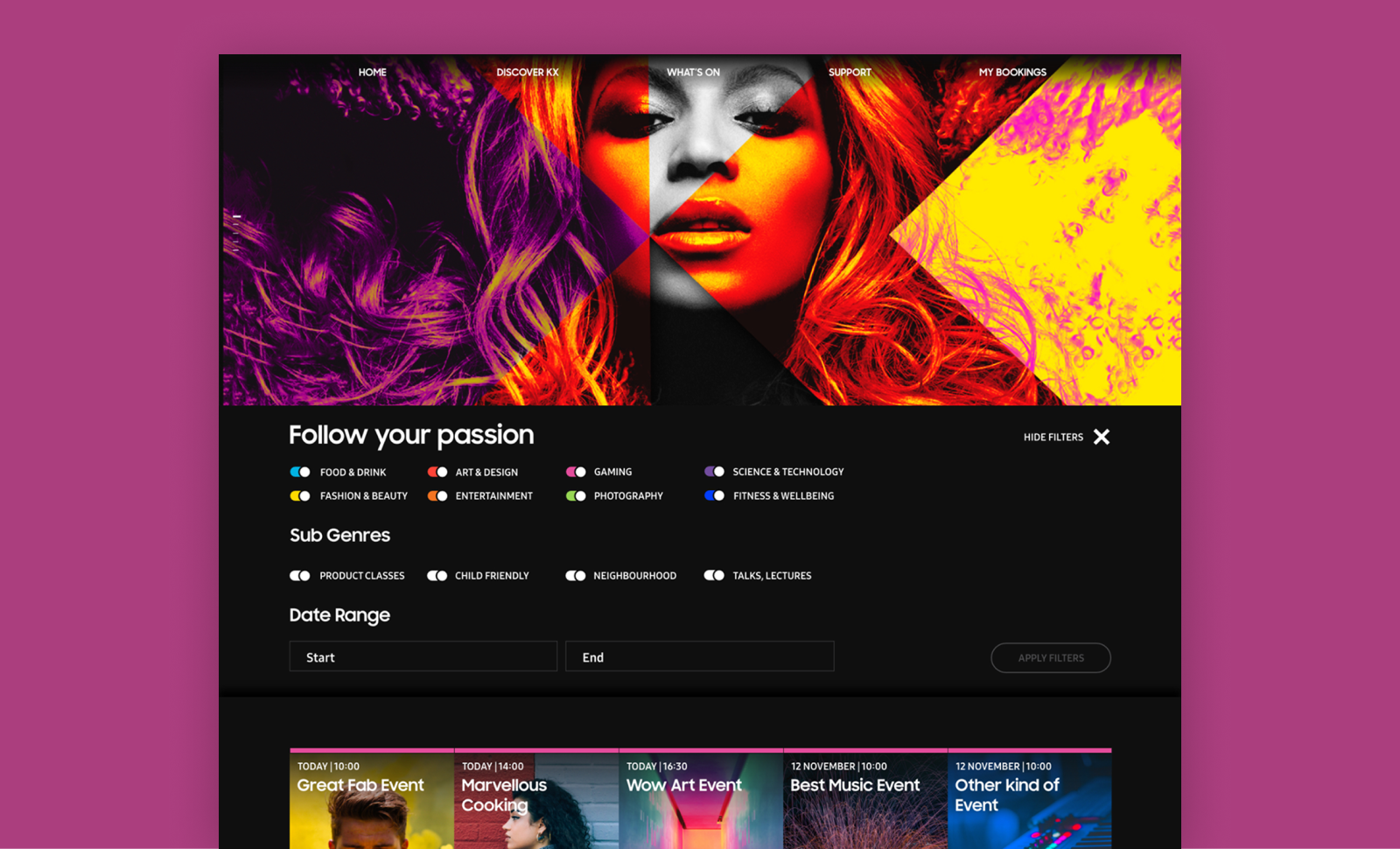
Snapcraft is Canonical’s app store for Linux-based operating systems. It is the equivalent of the App Store on iOS or macOS, or the Google Play Store on Android.
When a developer wants to release an application to one of Canonical’s app stores, they must choose the computer architectures and risk levels for the release. Snapcraft and Charmhub support five different architectures and four risk levels, allowing users to choose between the latest features or the most stable version of the app.
This feature was initially released without thorough testing or validation. However, it quickly gained widespread adoption, and most users in the Ubuntu community found it valuable. This success highlighted the need for further validation and improvements to provide a consistent, secure, and reliable experience.
Key requirements
Evaluate the current UI through testing and interviews of its users
Scope and prioritise improvements to be done based on research findings
Design a scalable MVP which builds on the existing implementation
Research
Context
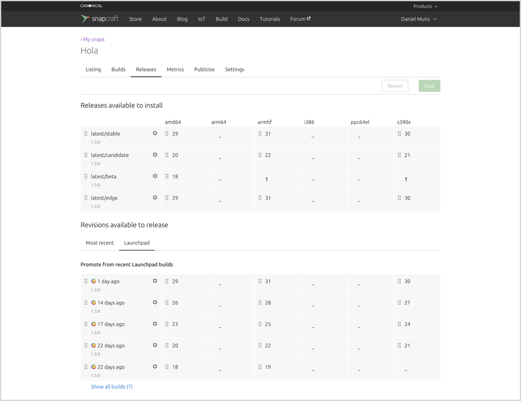
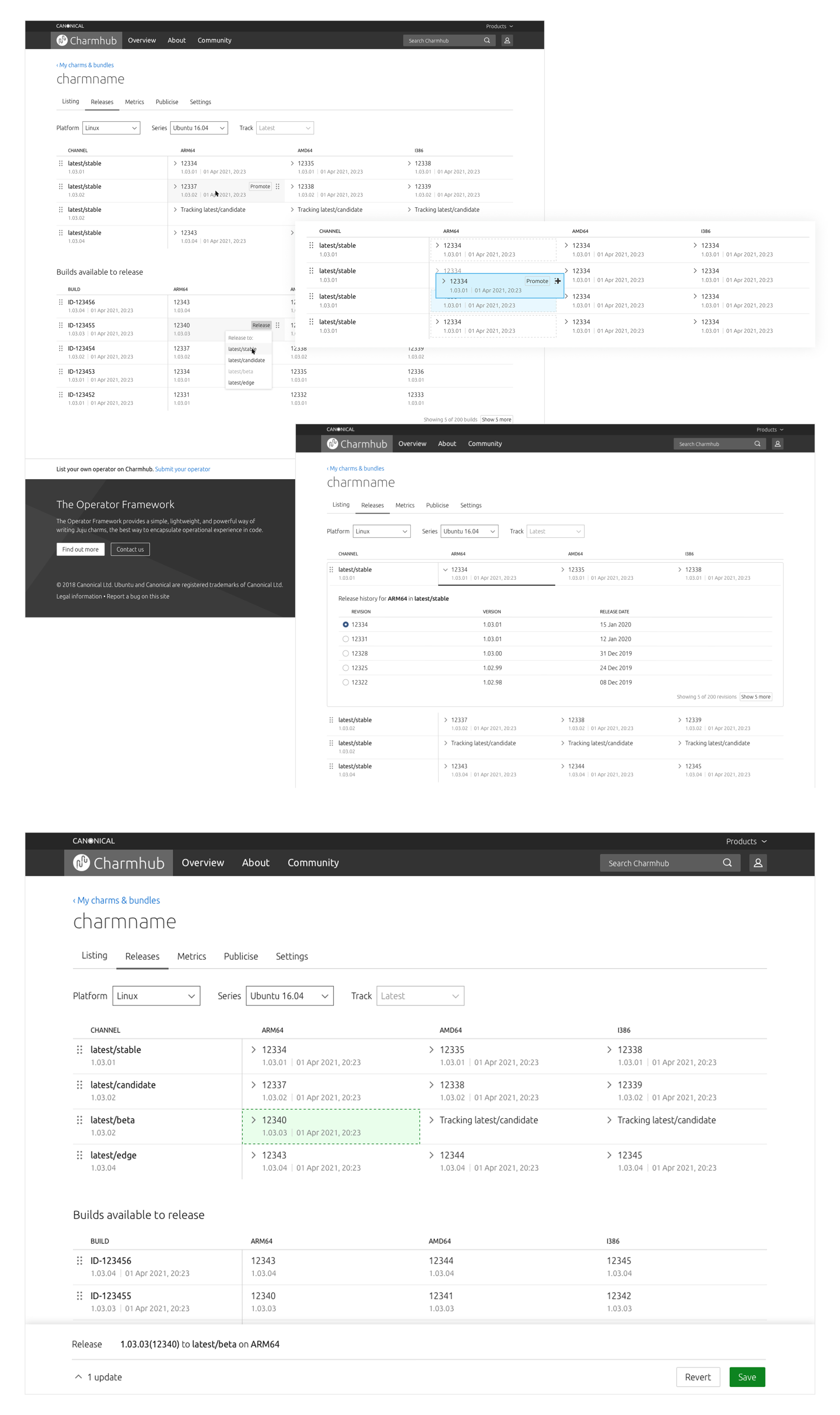
The starting point was a drag-and-drop UI where app developers could see which versions of their app had been published for each computer architecture and risk level. In this table, they could drag and drop a particular version of their app into either a column (representing an architecture) or a row (representing a risk level).
Below the table, there was another section listing previously built versions, allowing users to roll back to older versions if necessary.
Interview structure
I interviewed 10 users which owned their own apps in the store and were responsible for publishing them. The interviews had 3 main objectives:
- Learn about how this UI fits into their day-today and how often they use it.
- Understand the use cases for releasing their apps through the UI vs. the command-line tool.
- Observe how they use the current UI and identify its shortcomings.
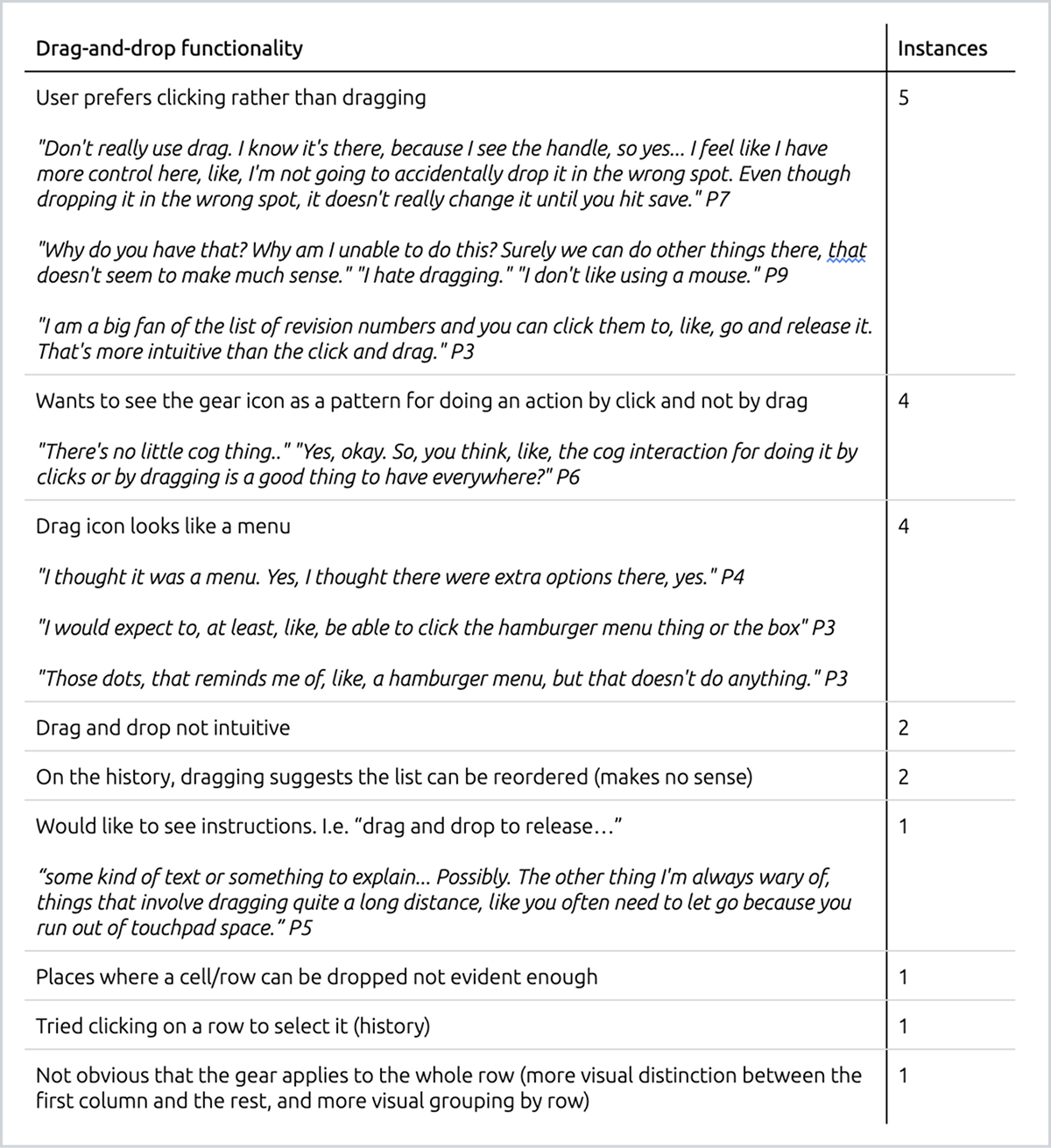
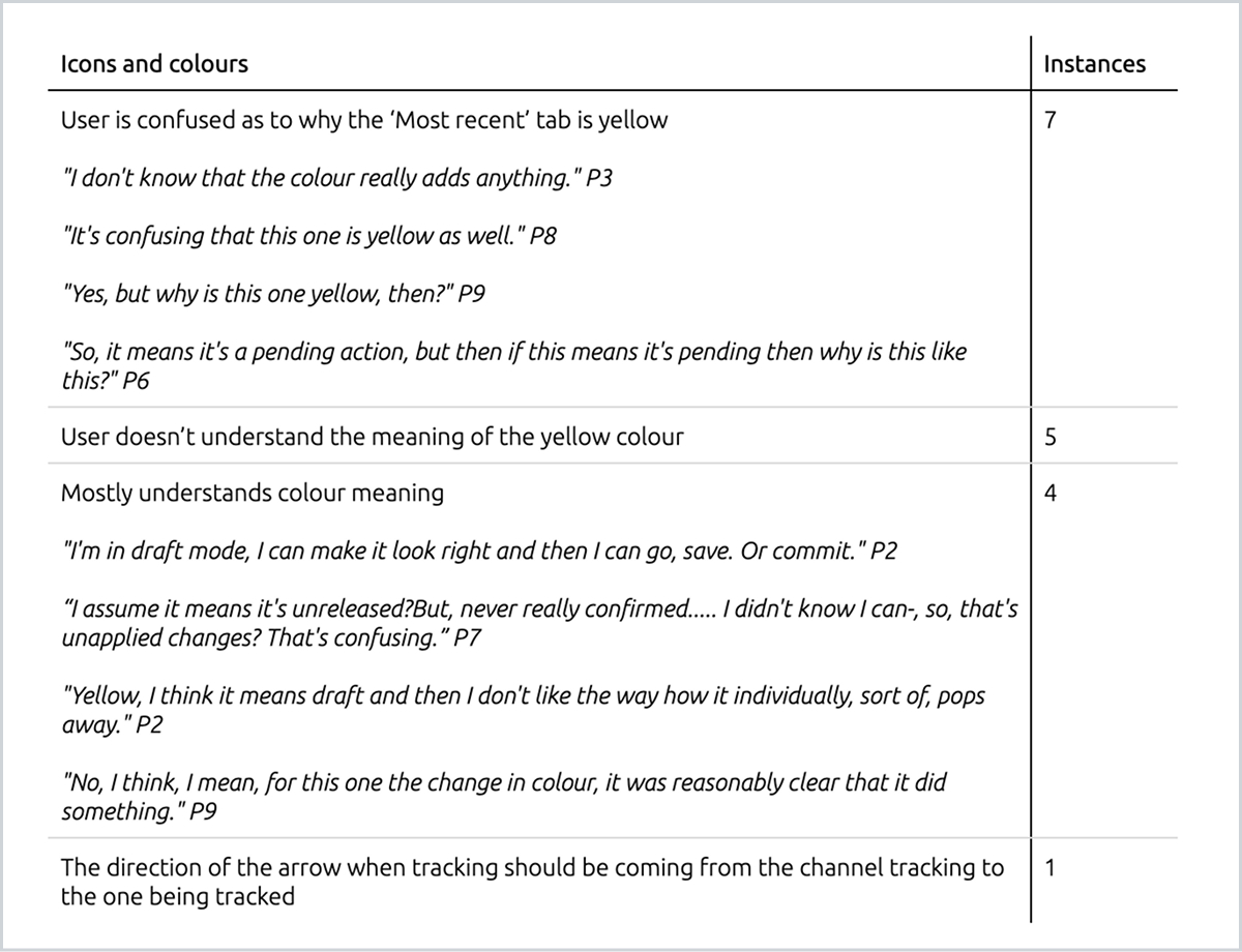
Analysis
Based on the notes and recordings from these interviews, I organised common trends and findings into categories, weighted according to how frequently they were mentioned.
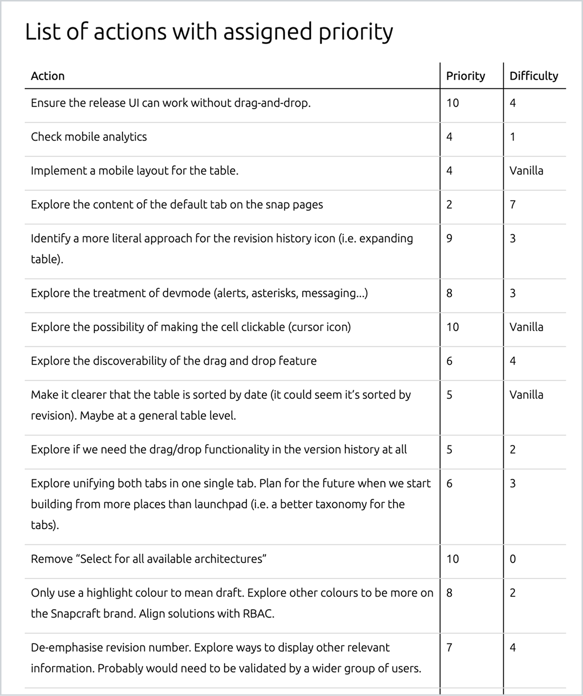
Findings and prioritisation
The key findings were shared and discussed with stakeholders to establish a list of actionable improvements. These actions were then prioritised and assessed for difficulty, helping to identify quick wins and more complex issues to include in the product backlog.
Design process
I created a series of visual explorations for each issue uncovered during user research to systematically review and improve the flaws of the previous UI. Here are some examples of how I addressed these concerns.
Ensure the UI works with and without drag and drop
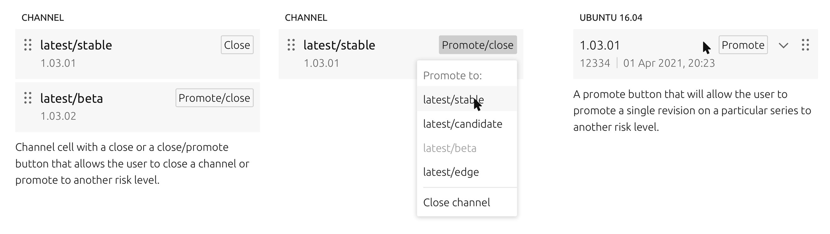
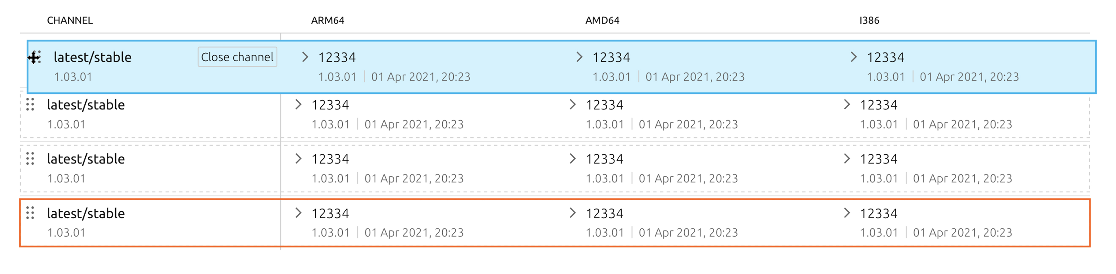
I added an action button to each cell and row, that allows the user to release it without the need of drag and drop. The button will be shown on hover for each individual cell to avoid repetition, but it will be there by default on the row headings.
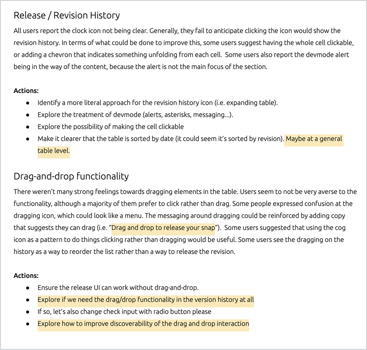
Identify a more literal approach to show release history
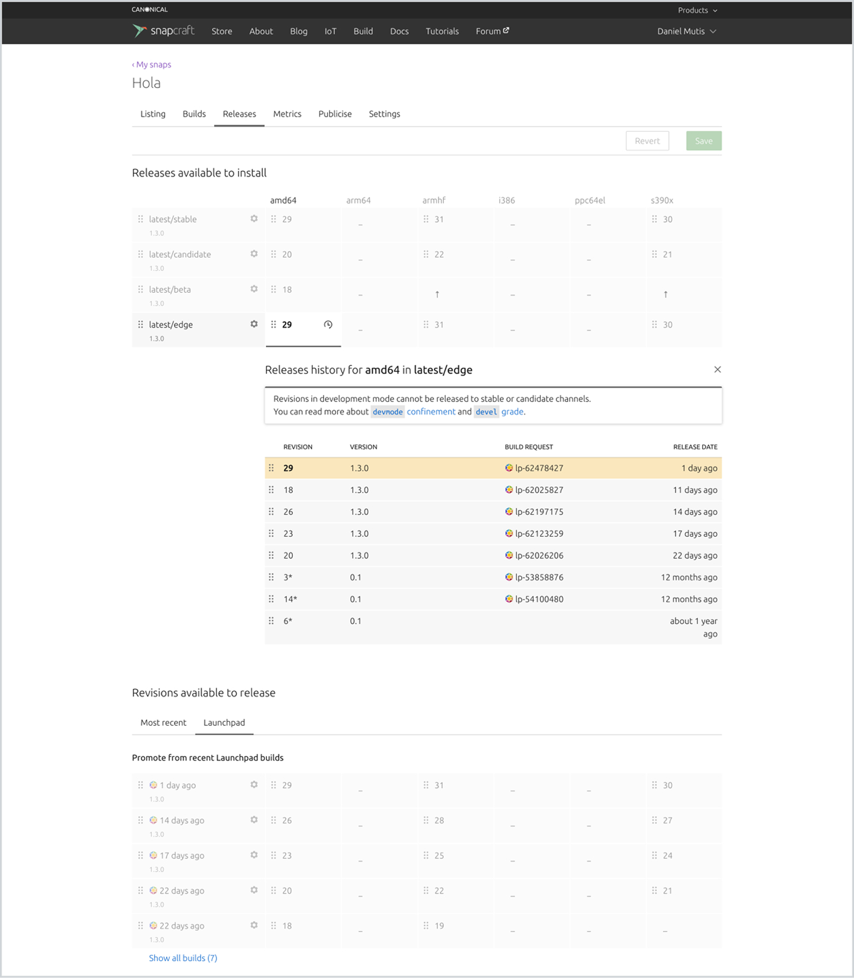
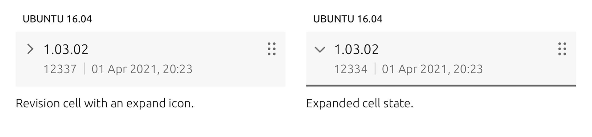
Instead of expanding the table using the history icon, I used a more literal approach that tells the user the table will expand without necessarily knowing what the content is going to be. This way, the interaction is communicated so they can easily discover the content.
De-emphasise version numbers and replace with meaningful information
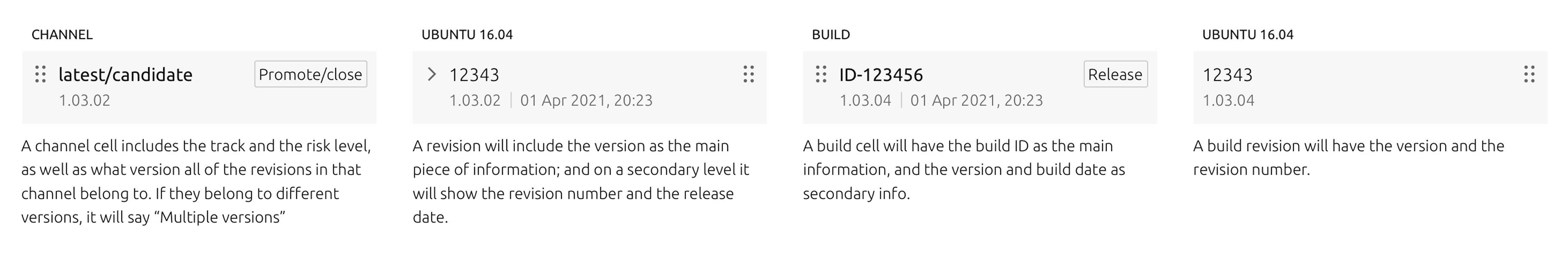
When the developer builds their application, each revision of that app is marked by a unique number. Previously this was the only information being shown on the cells, so I replaced it with a two lines of information which would add more meaningful information to identify each release.
Improve the saving mechanism to avoid errors
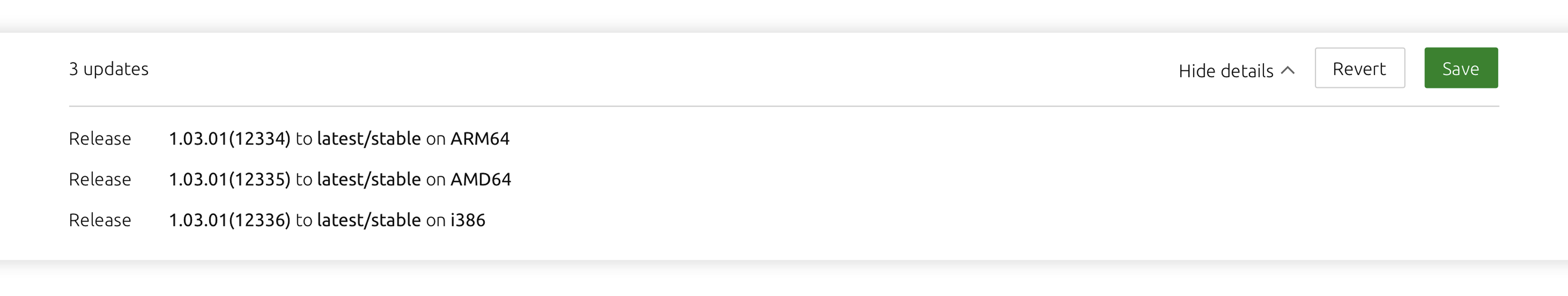
I made a bar sticky at the bottom of the page, that will appear only after a user has made a change. The bar can also expand to show a list of what has changed.
Drag and drop improvements
I redesigned the way in which drag and drop works in the UI in order to improve the affordance of the icon and so that the user has a better understanding of what to expect from the behaviour.
Project outcomes
To conclude the project, I produced a series of design and implementation guides for future development. These included improvements to functionality as well as changes to the table’s visual design to make it simpler and more intuitive.
Evaluation
The improved designs of the releases page were implemented in 2022 and are currently live on Snapcraft.io and Charmhub.io. At the end of the project, I conducted a series of interviews to validate my design decisions, which resulted in a reduction in users needing support for related issues.
Learnings
This project is a strong example of user research driving holistic improvements to an essential feature. In hindsight, I am very proud of the number of visual explorations and analyses that went into this work.
At the time, testing was mainly conducted using screenshots and gathering feedback on what users might hypothetically do or understand from the visuals. Since then, the UI has been implemented, opening opportunities for more dynamic, in-depth testing of the new designs.

Snapcraft.io releasing flow redesign
Canonical
Product design
Bringing Canonical’s Landscape into the modern age
Snapcraft is Canonical’s app store for Linux-based operating systems. It is the equivalent of the App Store on iOS or macOS, or the Google Play Store on Android.
When a developer wants to release an application to one of Canonical’s app stores, they must choose the computer architectures and risk levels for the release. Snapcraft and Charmhub support five different architectures and four risk levels, allowing users to choose between the latest features or the most stable version of the app.
This feature was initially released without thorough testing or validation. However, it quickly gained widespread adoption, and most users in the Ubuntu community found it valuable. This success highlighted the need for further validation and improvements to provide a consistent, secure, and reliable experience.
Key requirements
Evaluate the current UI through testing and interviews of its users
Scope and prioritise improvements to be done based on research findings
Design a scalable MVP which builds on the existing implementation
Research
Context
The starting point was a drag-and-drop UI where app developers could see which versions of their app had been published for each computer architecture and risk level. In this table, they could drag and drop a particular version of their app into either a column (representing an architecture) or a row (representing a risk level).
Below the table, there was another section listing previously built versions, allowing users to roll back to older versions if necessary.
Interview structure
I interviewed 10 users which owned their own apps in the store and were responsible for publishing them. The interviews had 3 main objectives:
- Learn about how this UI fits into their day-today and how often they use it.
- Understand the use cases for releasing their apps through the UI vs. the command-line tool.
- Observe how they use the current UI and identify its shortcomings.
Analysis
Based on the notes and recordings from these interviews, I organised common trends and findings into categories, weighted according to how frequently they were mentioned.
Findings and prioritisation
The key findings were shared and discussed with stakeholders to establish a list of actionable improvements. These actions were then prioritised and assessed for difficulty, helping to identify quick wins and more complex issues to include in the product backlog.
Design process
I created a series of visual explorations for each issue uncovered during user research to systematically review and improve the flaws of the previous UI. Here are some examples of how I addressed these concerns.
Ensure the UI works with and without drag and drop
I added an action button to each cell and row, that allows the user to release it without the need of drag and drop. The button will be shown on hover for each individual cell to avoid repetition, but it will be there by default on the row headings.
Identify a more literal approach to show release history
Instead of expanding the table using the history icon, I used a more literal approach that tells the user the table will expand without necessarily knowing what the content is going to be. This way, the interaction is communicated so they can easily discover the content.
De-emphasise version numbers and replace with meaningful information
When the developer builds their application, each revision of that app is marked by a unique number. Previously this was the only information being shown on the cells, so I replaced it with a two lines of information which would add more meaningful information to identify each release.
Improve the saving mechanism to avoid errors
I made a bar sticky at the bottom of the page, that will appear only after a user has made a change. The bar can also expand to show a list of what has changed.
Drag and drop improvements
I redesigned the way in which drag and drop works in the UI in order to improve the affordance of the icon and so that the user has a better understanding of what to expect from the behaviour.
Project outcomes
To conclude the project, I produced a series of design and implementation guides for future development. These included improvements to functionality as well as changes to the table’s visual design to make it simpler and more intuitive.
Evaluation
The improved designs of the releases page were implemented in 2022 and are currently live on Snapcraft.io and Charmhub.io. At the end of the project, I conducted a series of interviews to validate my design decisions, which resulted in a reduction in users needing support for related issues.
Learnings
This project is a strong example of user research driving holistic improvements to an essential feature. In hindsight, I am very proud of the number of visual explorations and analyses that went into this work.
At the time, testing was mainly conducted using screenshots and gathering feedback on what users might hypothetically do or understand from the visuals. Since then, the UI has been implemented, opening opportunities for more dynamic, in-depth testing of the new designs.
Snapcraft.io releasing flow redesign
Canonical
Product design
Improving the way app developers publish their apps to Snapcraft
Snapcraft is Canonical’s app store for Linux-based operating systems. It is the equivalent of the App Store on iOS or macOS, or the Google Play Store on Android.
When a developer wants to release an application to one of Canonical’s app stores, they must choose the computer architectures and risk levels for the release. Snapcraft and Charmhub support five different architectures and four risk levels, allowing users to choose between the latest features or the most stable version of the app.
This feature was initially released without thorough testing or validation. However, it quickly gained widespread adoption, and most users in the Ubuntu community found it valuable. This success highlighted the need for further validation and improvements to provide a consistent, secure, and reliable experience.
Key requirements
Evaluate the current UI through testing and interviews of its users
Scope and prioritise improvements to be done based on research findings
Design a scalable MVP which builds on the existing implementation
Research
Context
The starting point was a drag-and-drop UI where app developers could see which versions of their app had been published for each computer architecture and risk level. In this table, they could drag and drop a particular version of their app into either a column (representing an architecture) or a row (representing a risk level).
Below the table, there was another section listing previously built versions, allowing users to roll back to older versions if necessary.
Interview structure
I interviewed 10 users which owned their own apps in the store and were responsible for publishing them. The interviews had 3 main objectives:
- Learn about how this UI fits into their day-today and how often they use it.
- Understand the use cases for releasing their apps through the UI vs. the command-line tool.
- Observe how they use the current UI and identify its shortcomings.
Analysis
Based on the notes and recordings from these interviews, I organised common trends and findings into categories, weighted according to how frequently they were mentioned.
Findings and prioritisation
The key findings were shared and discussed with stakeholders to establish a list of actionable improvements. These actions were then prioritised and assessed for difficulty, helping to identify quick wins and more complex issues to include in the product backlog.
Design process
I created a series of visual explorations for each issue uncovered during user research to systematically review and improve the flaws of the previous UI. Here are some examples of how I addressed these concerns.
Ensure the UI works with and without drag and drop
I added an action button to each cell and row, that allows the user to release it without the need of drag and drop. The button will be shown on hover for each individual cell to avoid repetition, but it will be there by default on the row headings.
Identify a more literal approach to show release history
Instead of expanding the table using the history icon, I used a more literal approach that tells the user the table will expand without necessarily knowing what the content is going to be. This way, the interaction is communicated so they can easily discover the content.
De-emphasise version numbers and replace with meaningful information
When the developer builds their application, each revision of that app is marked by a unique number. Previously this was the only information being shown on the cells, so I replaced it with a two lines of information which would add more meaningful information to identify each release.
Improve the saving mechanism to avoid errors
I made a bar sticky at the bottom of the page, that will appear only after a user has made a change. The bar can also expand to show a list of what has changed.
Drag and drop improvements
I redesigned the way in which drag and drop works in the UI in order to improve the affordance of the icon and so that the user has a better understanding of what to expect from the behaviour.
Project outcomes
To conclude the project, I produced a series of design and implementation guides for future development. These included improvements to functionality as well as changes to the table’s visual design to make it simpler and more intuitive.
Evaluation
The improved designs of the releases page were implemented in 2022 and are currently live on Snapcraft.io and Charmhub.io. At the end of the project, I conducted a series of interviews to validate my design decisions, which resulted in a reduction in users needing support for related issues.
Learnings
This project is a strong example of user research driving holistic improvements to an essential feature. In hindsight, I am very proud of the number of visual explorations and analyses that went into this work.
At the time, testing was mainly conducted using screenshots and gathering feedback on what users might hypothetically do or understand from the visuals. Since then, the UI has been implemented, opening opportunities for more dynamic, in-depth testing of the new designs.